Architects Piotr Michalewicz and Marcin Urbanek and artist-historian Łukasz Mieszkowski won first prize in the international competition for the development of a new memorial concept at the site of the former Nazi extermination facility in Sobibór. The team won the competition in July 2013, and in October of the same year, the Polish government accepted their design and awarded them tenders. The memorial’s construction began in the spring 2017, with funds coming entirely from the Polish Ministry of Culture. The memorial and museum, which will come under the supervision of the Majdanek State Museum. is scheduled to be completed in the fall of 2022. Mieszkowski, in an original article for K., takes us behind the scenes of this innovative project.
Because IT means encountering a stone wall,
and understanding that this wall will not give way to any of our pleas.
Czesław Miłosz, IT
1.
The primary aim of the new Sobibór memorial is protection. One must first of all protect the dead, murdered in the extermination facility. But it also takes care of the living who visit the grounds.
Paramount in our considerations are the victims. Death did not end the humiliation of 178,000 Europeans of Jewish origin. The decomposing bodies were eventually dug out of the mass graves, burned, ground up, mixed with soil and scattered around the area, to be desecrated for decades to come. First by grave robbers from the surrounding villages and towns, in search of valuables, later by those on a stroll in the vicinity, and finally, paradoxically, by those who came to pay homage to them.
We endeavored to transform the crime scene into a proper cemetery, and conceived of a design with the input of the Chief Rabbi of Poland. The burial ground would be cut off from the visitors’ space, marking an impassable border between the world of the living and the world of the dead. We might then provide, albeit in a belated fashion, a modicum of dignity to the murdered.
The logic of protecting visitors seemed clear – we had to protect them from inadvertently stepping on the victims’ remains. But the notion of protection transcended this basic and fairly tractable imperative. Protection is related, too, to the physical and emotional experience of being on the site of an extermination facility, the effects it can have.
2.
In recent decades, the dominant trend in the architectural and artistic representation of the extermination of European Jews has developed and matured. Krzysztof Lenartowicz, an architect and theoretician of the psychology of architecture at the Cracow University of Technology, poetically defined it as “the architecture of dread.”[1] The space is designed to arouse the visitor’s emotions as much as possible, to elicit sadness, solitude or disorientation – or merely to scare him.
According to James Ingo Freed, one of the trend’s founders and architect of the Holocaust Memorial Museum in Washington, D.C., such a solution results from the complete inability to rationally embrace and understand the phenomenon of the Holocaust.[2] Therefore, an attempt should be made to approach it not on the intellectual plane, but via sentiments and the “aura” of particular places – one should encounter the relics of a tragic history in a specific emotional state. Advocates of this architectural form believe that it underlines the singularity of the Holocaust, focusing attention and advancing the educational process. But it can also go further.
Lenartowicz describes as “laboratories of psychological Architecture” a more radical form of the architecture of the dread, in which visitors are encouraged to step into the shoes of Holocaust victims. These monuments seek to recreate in visitors the physical actions – e.g. repeating the transition from ramps to gas chambers – and the feelings of the murdered Jews. This method, drawing on the principles of postmodern architecture and the vogue of reenactments, suggests that in order to better understand history, one must experience it again personally. Literary scholar Katarzyna Bojarska avers that architects do not seek to inflict “secondary traumatization” on visitors, but rather “knock the subject out of its cognitive and perceptive patterns”[3] in order to increase intellectual and emotional contact with the place of history and memory. She describes this process, in a curious fashion, as “shock induction.”
Representations of the architecture of dread can be seen both in ordinary spaces – like Holocaust museums or Holocaust galleries in Jewish museums – as well as on authentic sites of martyrdom.
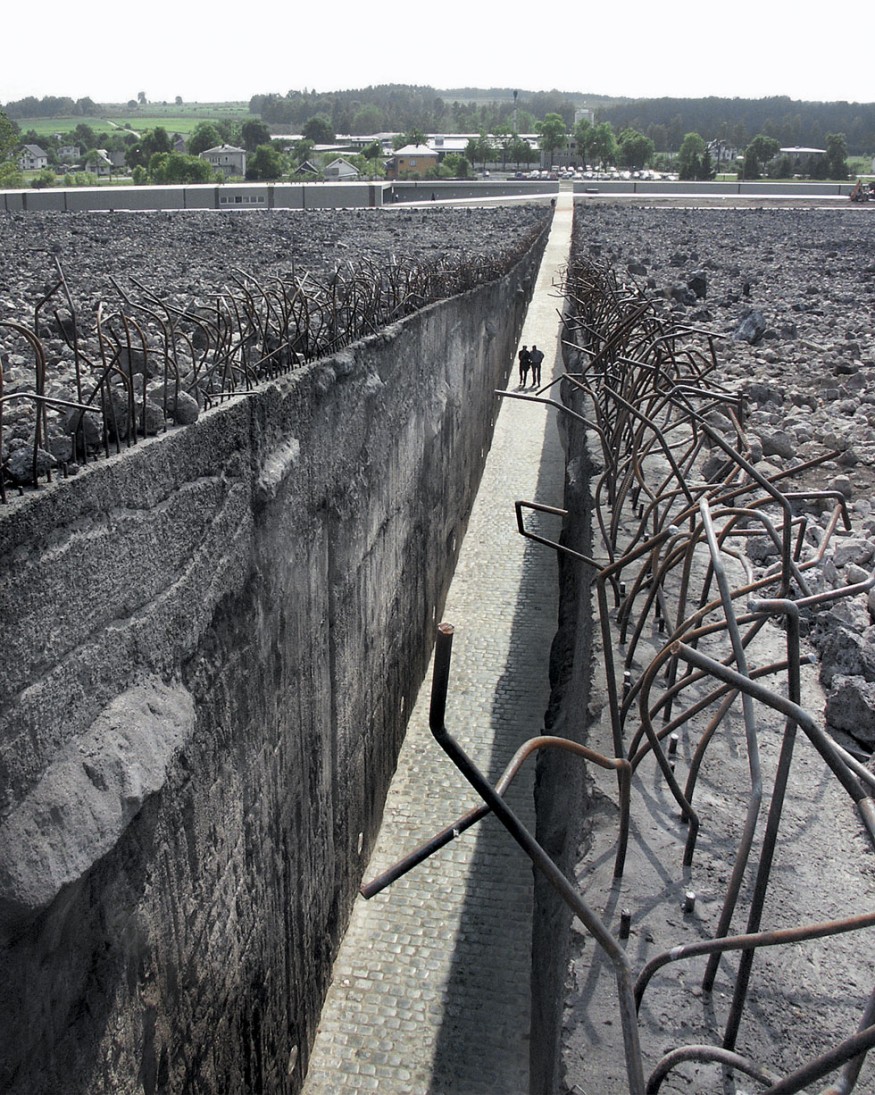
At the Belzec memorial, visitors transit through a rift bisecting an inclined slope on which there are mass graves. (Fig. 1) The visitors then tread the same path that the victims did from train cars to gas chambers, like them descending into the abyss – high walls, covered with expressive sculptural reliefs, surround them; in the central part of the memorial monument-goers can even seek temporary shelter, through the alcoves carved into the walls. (Fig. 2) The memorial’s creators have pulled off a feat of seriousness, harmony, majesty even; however, we observe in Bełżec an iconic ‘tunnel of fear’ epitomizing the architecture of dread.
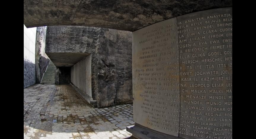
There is a risk here, as the visitors pass just a few meters away from multiple layers of human remains. There is something ludic in this simulation, resembling the world of entertainment. How does this experience upend the expectations of visitors, serving the aims of “shock induction?” One can assume in places such as Bełżec, most visitors expect to feel fear, loneliness and depression – which is why so many people avoid these places. When they arrive, they get exactly what they anticipated.
These methods can prove alluring, especially when it comes to appealing to young visitors, who in places of remembrance expect emotional and sensory experiences. We, the designers of the new memorial in Sobibór, opted for a different artistic representation of extermination, which would be reflected in how visitors interacted with the site.
Eliciting from modern-day visitors – most of them never experienced mass violence – premonitions of cruel death seemed banal and impossible, and thus inappropriate. We wanted to protect our visitors from this trite and ultimately false experience of a Holocaust memorial.
3.
Before we even started working on a design for the memorial, we settled on the decision to avoid the architecture of dread in o for Sobibór. During our first visit to the grounds of the former extermination facility, we found that the site did not immediately conjure ominous feelings. “Aura,” which by definition should be present at the memorial site, was not perceptible, probably due to the lack of visible, tangible artifacts to attest to historical events. The clearing in which the ashes of tens of thousands had been dumped, the forest through which the victims trudged on their way to death, did not evoke terror for me. The scene appeared on a visceral level as pastoral, almost enchanting, a place where spring might burst forth in its splendor.
The landscape’s bucolic peace was deceptive; both natural and architectural features – an initial memorial had been erected there in the sixties during the Communist period – belied the true nature of the site. The forest, planted by the camp’s later prisoners, who were summarily shot, served to obliterate the traces of the extermination facility and the crime that took place there. The forest, an authentic material artifact of the period, lengthened rather than shortened the intellectual and emotional distance separating visitors from historical events. Those woods were beautiful, dark and deep – entirely ignorant of human despair, tragedy and madness. The burial mound, made of soil not containing ashes, distracted attention from the clearing under which sat human remains; the alley leading to the mound ran straight through one of the burial sites, causing visitors to step on and desecrate the earth above the human remains. (Fig. 3)
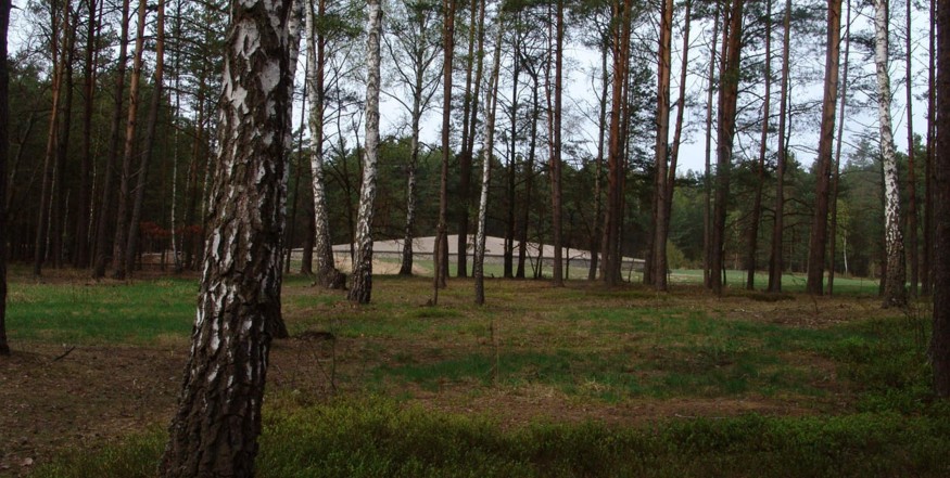
The forest’s beauty interfered with attempts to draw closer to the past emotionally. The old memorial literally led visitors astray due to the situation of the various elements on the site. One had no choice but to discover the site through the abstract and intellectual, i.e., an awareness of history. The old memorial’s key elements were emotionally silent – the clearing with the mass graves did nothing to connect visitors and victims. The visitors were standing in front of a place that should have never existed, the perfect metaphorical “abyss”; one only saw a forest clearing and an inconspicuous hill.
The principles of the architecture of dread dictated that designers should transform this place into a “laboratory of psychological architecture,” suggesting or even imposing emotions that would be helpful in “properly” experiencing the visit. These concepts were reflected in the design competition for a new Sobibor memorial. In addition to the task of protecting the mass graves and human remains from further desecration, the memorial was also to play an educational role – informing visitors about the history of the facility, the fate of the victims and perpetrators, and the logistics of the crime – by partially recreating the site’s original topography.
Therefore, on top of designing the museum building, we also needed to clearly demarcate the road that had once led to the gas chambers. The competition organizers seemed to intend for this reconstructed road to form both the emblematic and material core of the new memorial. This is how most entrants to the competition interpreted the role of this path. Of the 64 submitted projects, all – except two – proposed that the road to the gas chambers serve as the primary path for visitors, taking them past the mass graves. These proposals duplicated all the advantages and disadvantages of the dominant method – clear, axial layouts emphasizing the visit’s narrative, the necessity of following the trail of death turning the experience into a pilgrimage and inducing emotional identification with the victims.
We chose the opposite tack due to our fundamental misgivings about the architecture of dread and the aforementioned nature of the site; we decided to limit physical and visual access to the mass graves and draw a bright line between visitors and victims.
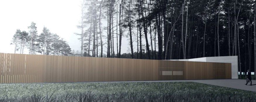
The distance took the form of an off-white concrete wall, rising straight from the undergrowth of the forest, standing out against the dark green trees and tightly circling the clearing, blocking the living from this part of the memorial. Visitors would be banned from this sanctum sanctorum of the memorial, not even allowed to catch a glimpse of the burial ground.
The essence of the idea of the new memorial was the visitor’s contact with the wall, or at least how we imagined that contact, as encapsulated in a fragment of a poem by Czesław Miłosz. The memorial’s epitaph is this article’s epigraph. The poem comes from Milosz’s last volume of poetry, referring both to the particular sentiments of the Holocaust victim and a universal pathos. In Sobibór, Miłosz’s poetic and metaphorical wall becomes material. In the modern world where everything is commercialized and accessible, mediated through interactive forms of education and entertainment, this stationary barrier reminds people of the enormous distance that separates them from the void of Sobibór. The concrete wall, though devoid of formal references, thus proves eloquent. As defined by Prof. Eleonora Jedlińska, a researcher on modern art and the Holocaust. a strict, dignified, modest, gray plane becomes “a testimony to the unimaginable.”[4]
4.
The design advanced in the competition (Fig. 4) was ultimately more spare and laconic than the one now under construction. The original blueprints featured a museum building and a wall marking the route to the gas chambers, ringing both the suspected location of the gas chambers and the clearing with the mass graves. The clearing was to be covered with crushed white rock, lending the area a uniform and singular appearance.
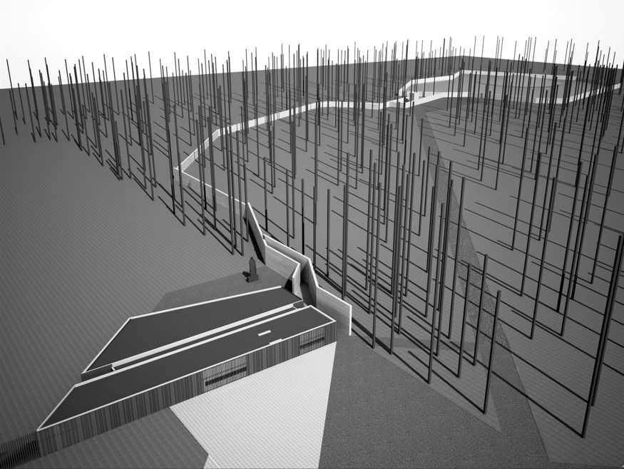
We considered the idea of closing – even visually – access to the mass graves clearing one of the most appropriate choices. We feared, however, that this choice might prove too radical for the jury and, later. visitors. Therefore, in our submission, we planned for a small gap in the wall onto the mass graves, permitting visitors a limited view of the clearing. (fig. 5)
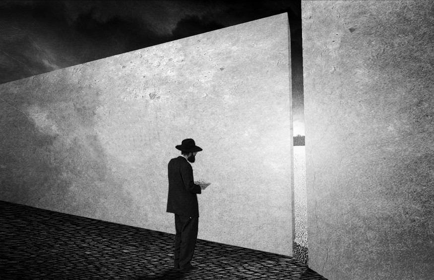
The judges appreciated the project’s symbolic value, writing in their decision that our design had clearly been informed by a deep philosophical reflection. However, victims’ families from the Netherlands rejected the idea of limiting visual contact with the clearing. We accommodated these demands in creating an open view of the mass graves through a wide opening in the walls. We discouraged visitors from treading on the site by covering the surface in white crushed rock and installing a lip between the clearing and the visitors’ path – museum-goers, we believed, would take a hint from these design features. (Fig. 6)

We settled on a final design in concert with a steering Committee that included representatives of the Polish, Dutch and Slovakian Ministries of Culture, the Yad Vashem Institute and the Majdanek State Museum. The results of archaeological research conducted on the site also informed our choices.
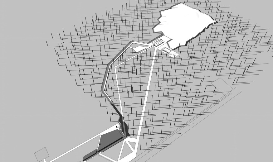
The memorial’s educational function was to be its most important goal. Our team had to construct a path connecting the road to the gas chambers and the mass graves clearing with other places of importance to the history and topography of the extermination facility and concentration camp: the railway ramp, the so-called selection square, the road to the gas chambers, the Sonderkommando barracks, the concentration camp prisoners barracks, and the only surviving building from the time, the commandant’s house. We had to revamp the network of trails on the grounds in order to achieve this goal. A path was created near the wall that leads the visitor from the railway ramp to the clearing and back along the main avenue. (Fig. 7) The most important parts of the final version of the monument are characterized below.
4.1 Wall Symbolizing the Route to the Gas Chambers
According to the guidelines of the steering committee, the tour now runs along the wall indicating the route to the gas chambers building. The steering committee wanted us to bring the path – and consequently the visitors – closer to the wall, encouraging contact with the barrier and engagement with the mass graves.
Here we came to a fundamental conflict between the reflection that motivated our design and the imperatives of some of our partners. The priority of our partners from the Yad Vashem Institute was to recreate the road in its historical length and width, allowing visitors to move along it toward the gas chambers building site and mass graves clearing. Such an idea ran up against our resolution to avoid the architecture of dread and the simulation of experience. We managed to work out a compromise: the wall would run the western edge of the road to the gas chambers and the road’s trace would be visible but unusable, elevated and covered in crushed white rock. (Fig. 8). The visitors’ path would approach the wall and the old road but not parallel either. We thus managed to reconcile opposing priorities – the need to relate the remoteness, the impossibility of the victims’ experience; the need to highlight this last itinerary of the victims.
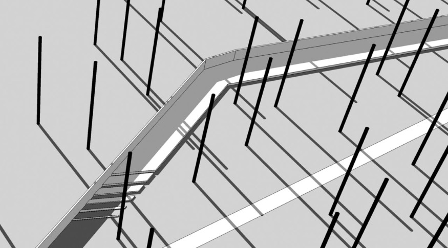
Due to these controversies and protracted negotiations, the wall remained the last part of the monument to receive final approval – the feature is still not built, which is why it is shown here in visualizations and not photos. Luckily, in the fall of 2021, construction work started; if everything goes according to plan, the wall, and the entire monument, will be completed this fall.
4.2 Mass Graves Clearing
The clearing is the central element of the memorial. The ashes of nearly 180,000 people are buried there in at least nine ersatz burial pits. The ashes, mixed with soil, covers the entire 1.9 hectare area of the clearing. The final shape of the clearing’s redesign was decisively influenced by guidelines from the Chief Rabbi of Poland’s Commission on Funerals, which we researched as we came up with our design.
No one disagreed on the first order of business in the clearing; completely and permanently cover the area with material to prevent human remains from being washed out to the surface. We chose to encase the clearing in nearly 30 cm of crushed marble, with an additional layer of geotextile separating the marble from the ground. This met the protective requirements established by the rabbinical commission and Yad Vashem.
The choice of form and color depended entirely on us – the designers. In accordance with the ur-concept of the entire memorial – avoiding pathos acquired through pulling at the heartstrings of the visitors – we envisioned a smooth, bright clearing, resembling almost a mid-forest lake. The burial mound, already present on the site, would remain as a central, delicate counterpoint, a metaphor of and homage to memory (Fig. 9).
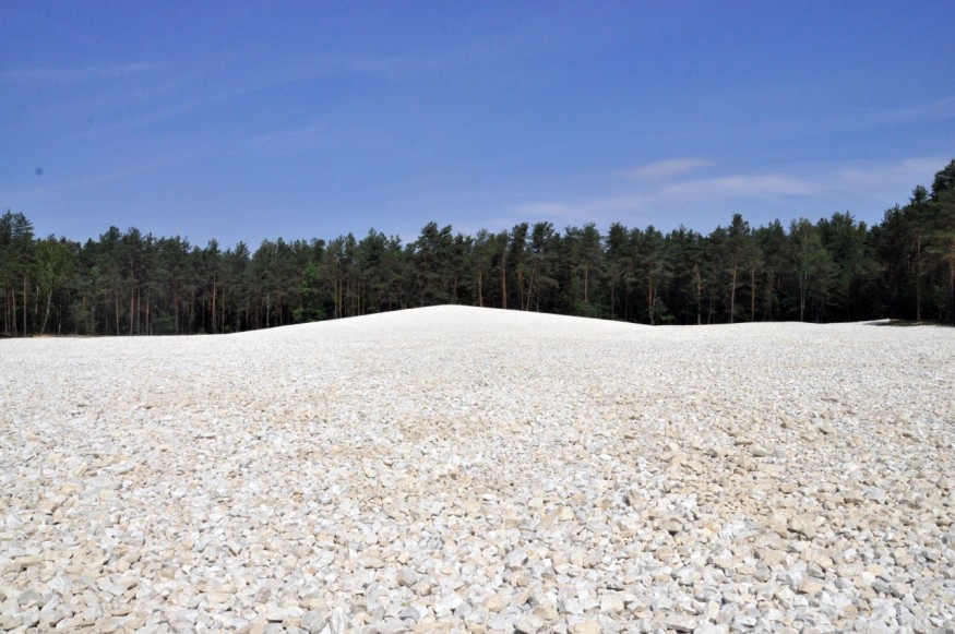
The marble’s whiteness, the low intensity of the color, diverts the minds of visitors from the sharp emotions that are not recommended here. Contrary to the mass graves in Bełżec – which are black and gray, the site full of tangled, expressive forms, the grounds bisected by the visitors’ path – the clearing in Sobibór is supposed to breath calmness and an impassable distance, an impression reinforced by the walls that will surround it.
The contrast between the lunar whiteness of the mass graves clearing, even as the land is forever tainted with the mark of Cain[5], irretrievably transformed, homes in on another of Sobibór’s paradoxes. We see in this space the chasm between the present reality of the extermination site – in which nature blooms in all its exuberance – and the imaginary of the death camp – a space without a landscape, gray, shrouded in fog, gashed with barracks and gas chambers[6]. In the clearing, both these dimensions appear, stare at each other, clashing and somehow complementing each other. We can never fully penetrate the story of what happened here.
4.3 Museum Building
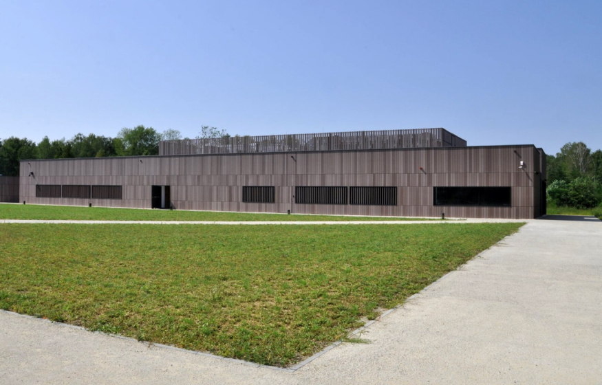
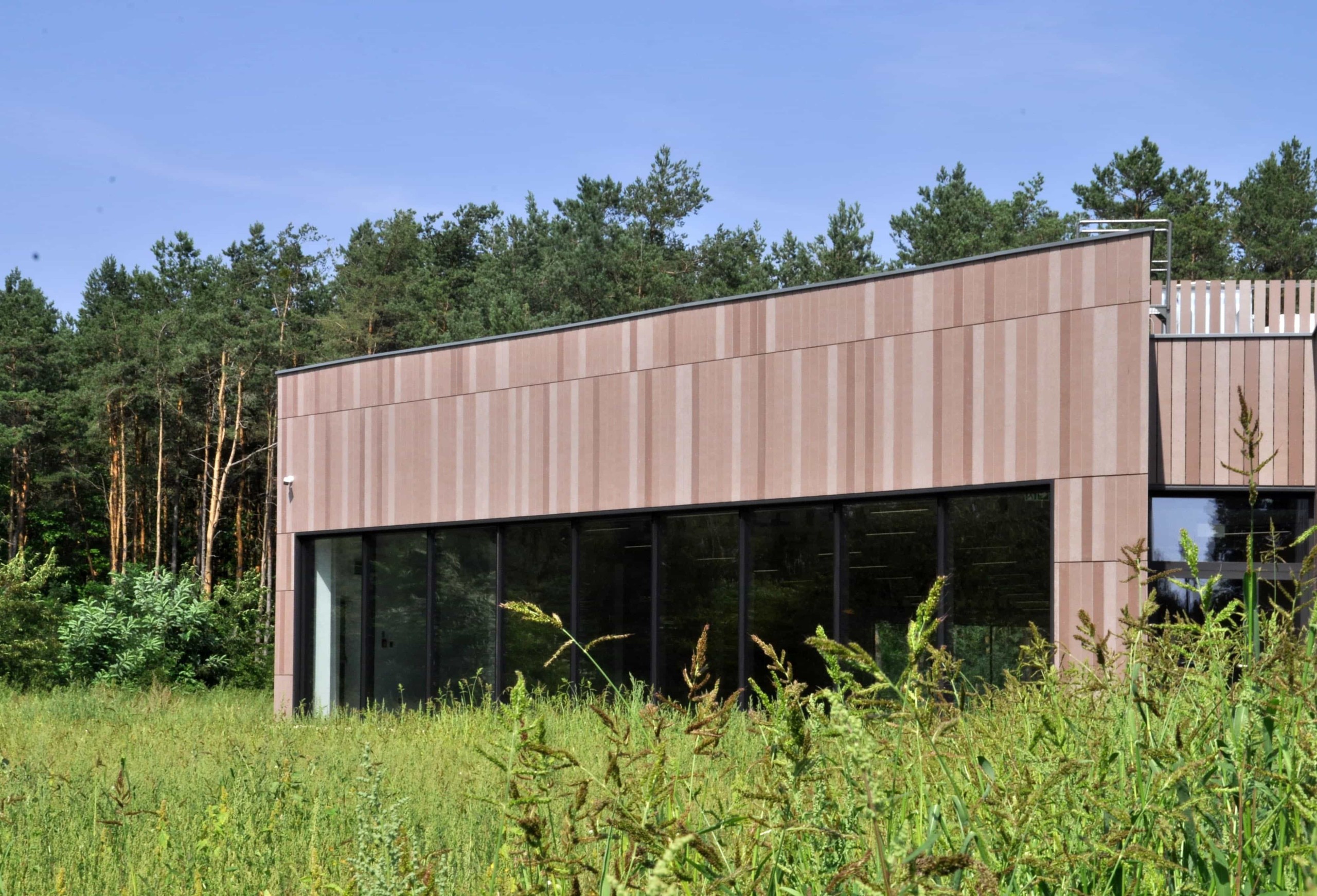
According to our assumptions, a visit to the museum should end rather than begin the entire memorial tour – visitors are already aware of the overall size of the extermination facility and know the location of its particular elements, which in turn helps them to better understand and internalize the content of the exhibition. The museum building plays an important educational as well as organizational and technical role. Even so it is treated as a supplement to the most important parts of the entire complex – the memorial and victims’ resting place. This resulted in specific formal decisions – the façade finished with imitation-wood concrete panels, modest and minimalist. More importantly, the museum is lower in height than the wall marking the road to the gas chambers. The building will literally stand in the shadow of the wall (fig. 10).

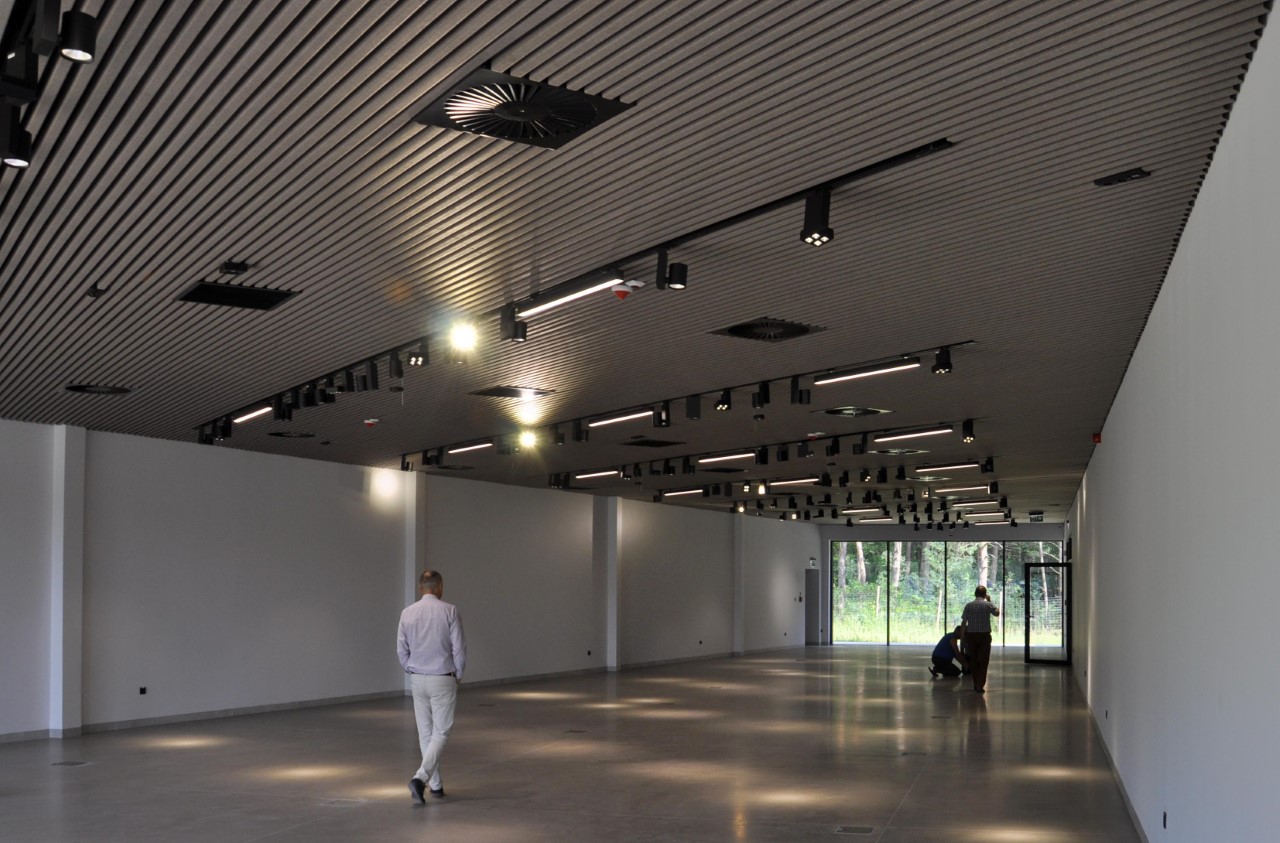
This feature is even more visible inside the main exhibition hall. The view through the northern narrow, glass gable wall will suddenly be cut off by the memorial wall (fig. 11). Due to this decision, the part of the exhibition devoted to genocide, in a sense, leaves the building and ends three meters further, at the entrance to the road leading to the gas chambers. The southern gable wall is much wider and offers an unobstructed, panoramic view of the meadow where the Sonderkommando uprising broke out and the forest in which the few refugees found shelter (Fig. 12). Thus, the building is suspended on the axis between death and freedom – the two extremes of the Sobibór victims’ fate. Its shape helps to understand the history of the extermination facility and the concentration camp, and thus strengthens the educational message of the exhibition.
In December 2017, the first stage of the museum construction was completed, as the facade of the exhibition hall was finished (fig. 13). In October 2020, the museum and permanent exhibition were opened to visitors.
5.
Our victory in the competition has not quieted critics who fault us for eschewing the architecture of dread. The director of the most important Polish concentration camp and extermination facility museum called the project “completely ill-considered.” The Dutch descendants of Sobibór’s victims accused us of trying to lock their grandparents behind a high wall, just as Germans had done 70 years ago, the Israeli relatives of the victims alleged that we wanted to impose our own subjective way of perceiving memorial sites, resulting from our hubris and lust for publicity.
Therefore, despite the fact that most of the above-mentioned controversies have been successfully resolved in the course of many months of meetings and negotiations, it seems important to conclude in further explaining the choices that we made as designers.
The sensory and emotional – to a lesser extent intellectual – conceit of the architecture of dread principles is an attempt to close the distance between self and other, to put oneself in the shoes of the Holocaust victim. Such memorial strategies aim to heighten the educational effect of the site, strengthen the sense of being in a singular place – the “aura.” However, as the example of Israeli youth groups most clearly shows, the architecture of the dread serves to cement the identity and solidarity of the ethnic group. There is a danger in even partially assuming the pain and tragedy of the victims, or of creating the illusion that something like this could happen to us. At the same time, the performative ritual of recreating the murdered’s last steps seem to have much in common with the therapeutic methods of confronting trauma. The patient, in the shrink’s office, goes through various phases of mourning, until he finally accepts the loss and reconciles himself with reality. Such a process seems maladapted for dealing with any genocide, let alone the Holocaust of the Jews.
One might assert that another method of coping – or rather not coping – with loss, developed in Western culture, is melancholy. It is the opposite of mourning, signifying a permanent rejection of the loss.[7] In our opinion, this is perhaps the most advisable way to process the extermination of Europe’s Jews, even at the price of the negative influence on someone’s psyche. It is exactly this feeling – melancholy – that our memorial is supposed to conjure.
In contrast to the peregrination through dark labyrinths of piled-up clothes, glasses and shoes in showcases, and rows of portrait photographs, the visitors to our memorial come into contact with the gray, uniform surface of the wall. This is not reminiscent of anything quotidian, and in its silence invites the visitor to engage with himself and his own thoughts. The wall instantiates the perpetual inability to comprehend the incomprehensible, the rift that forever separates visitors from victims, a temporal divide that remains despite spatial proximity.
Łukasz Mieszkowski
Łukasz Mieszkowski is a historian and visual artist from Warsaw, Poland. He is currently a Fulbright Scholar at UC Berkeley, working on his PhD entitled “Dragons and Lice. Poland in Times of Plague 1918-1922.” He also designs exhibitions, street furniture and architecture. He is a creator of the Museum and Memorial of the Former Death Camp in Sobibór and the Warsaw Ringelblum Archive Monument.–
Notes
| 1 | Krzysztof Lenartowicz, Architektura Trwogi (The Architecture of Dread) [in:] Pamięć Shoah. Kulturowe reprezentacje i praktyki upamiętnienia (Memory of the Shoah. Cultural representations and practices of commemoration), eds. by Tomasz Majewski, Anna Zeidler-Januszewska, Łodz 2011, pp. 632-645. |
| 2 | Ibid, p. 638. |
| 3 | K. Bojarska, Obóz-Muzeum… (Camp-Museum…), ibid, p. 140. |
| 4 | Eleonora Jedlińska, Obraz jest świadectwem niewyobrażalnego (The image is a testimony to the unimaginable), lecture given on April 13, 2016 at the POLIN Museum in Warsaw, available at https://www.youtube.com/watch?v=vmfxLp0lA4M |
| 5 | Halina Taborska, Sztuka w miejscu śmierci – polskie znaki pamięci w hitlerowskich obozach natychmiastowej Zagłady (Art at the Place of Death – Polish Marks of Memory in the Nazi Immediate Death Camps) [in:] Pamięć Shoah… (Memory of the Shoah…), op.cit., p. 28. |
| 6 | Jacek Małczyński, Drzewa “żywe pomniki” w Muzeum-Miejscu Pamięci w Bełżcu (“Living monuments” trees in the Bełżec Museum-Memorial), ibid, p. 48. |
| 7 | Jarosław Lubiak, O nowy kształt pamięci. Muzeum Żydowskie w Berlinie (For a new shape of memory. Jewish Museum in Berlin), ibid, p. 651. |
